Standard Field Options
| Option | Description |
|---|
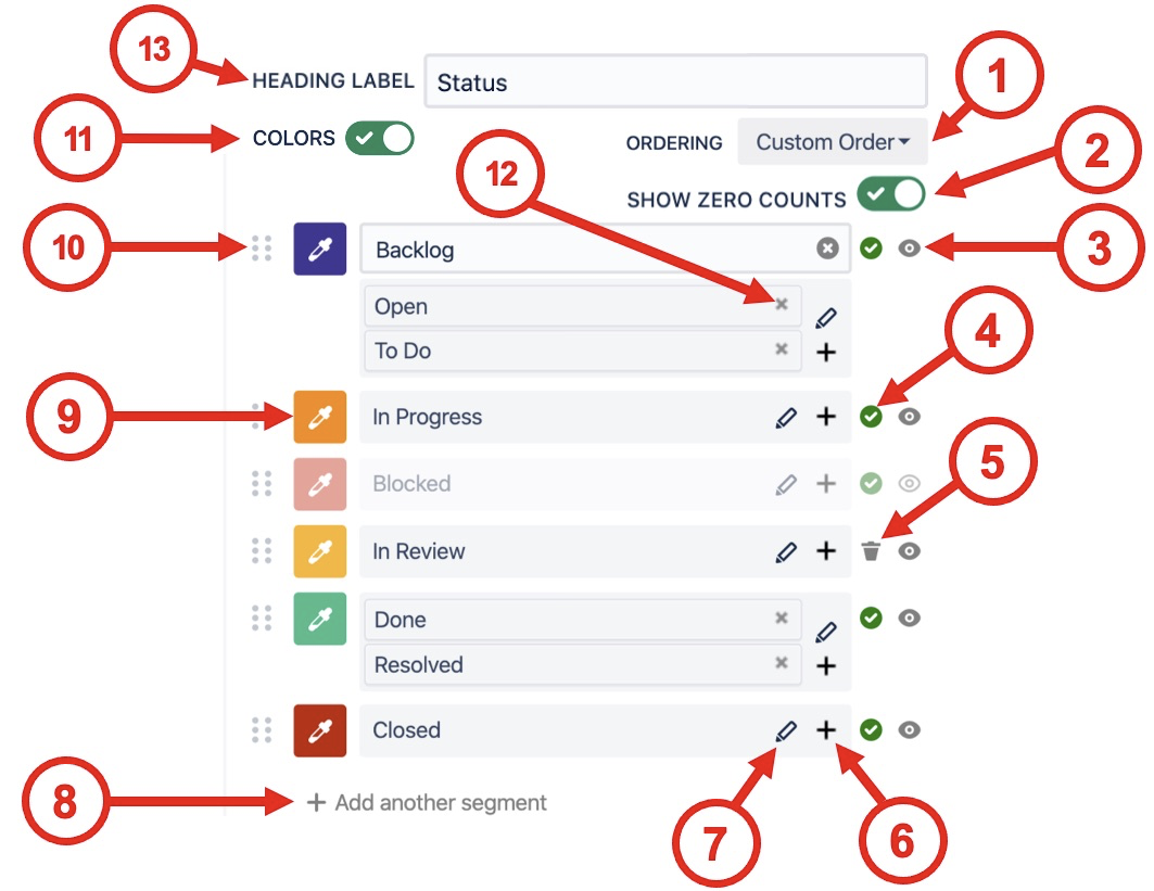
| 1 | Segment ordering | Orders segments by the value of their Counts or Names. Custom order is arranged by the user with the drag-and-drop interface. 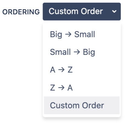
|
|---|
| 2 | Show zero counts | If the count value is zero for a segment use this selector to hide it from the chart. |
|---|
| 3 | Show / hide segments | If issues have been found for a segment then it cannot be deleted, but it can easily be hidden using show / hide segment button. 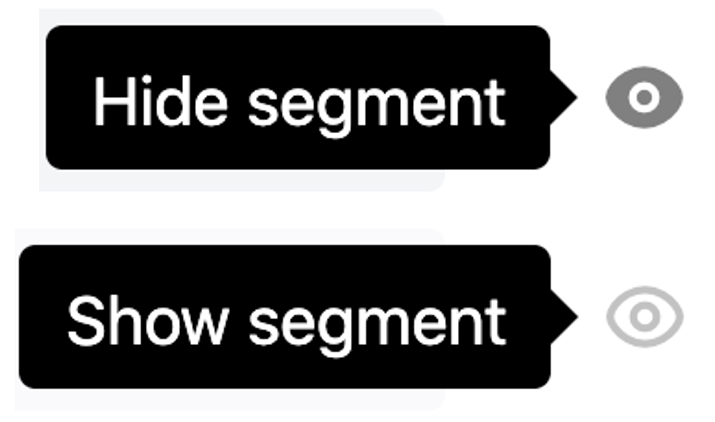
|
|---|
| 4 | Issues found indicator | A green tick indicates that issues have been found for the current segment. Hovering over the indicator shows a tooltip with the number of issues found. 
|
|---|
| 5 | Delete segment | When zero issues are found for a segment it can be deleted. 
|
|---|
| 6 | Add additional values | Clicking the + opens a drop-down menu to pick additional values. Values already in use in other segments have the suffix (Used option). If a used option is selected it will be moved into the currently selected segment. 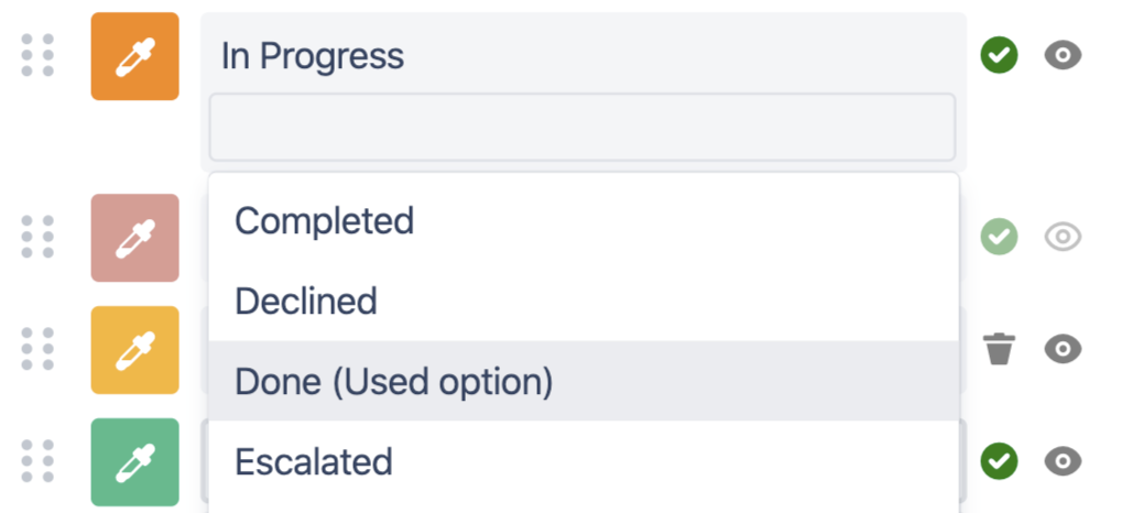
|
|---|
| 7 | Rename segment | Clicking the pencil button opens the "Name segment" input box. 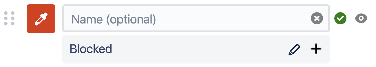
The original segment values are displayed as a tooltip when hovering over the new name in the legend table. 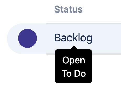
|
|---|
| 8 | Add another segment | If a value has not been found in the current search (e.g. you're making a template chart) then you can add additional segments. This allows you to select the colors, name and order of appearance even before any issues have been found. 
|
|---|
| 9 | Color picker | Pick from a color palette of 22 default options or use a custom hex code to get exactly what you need. 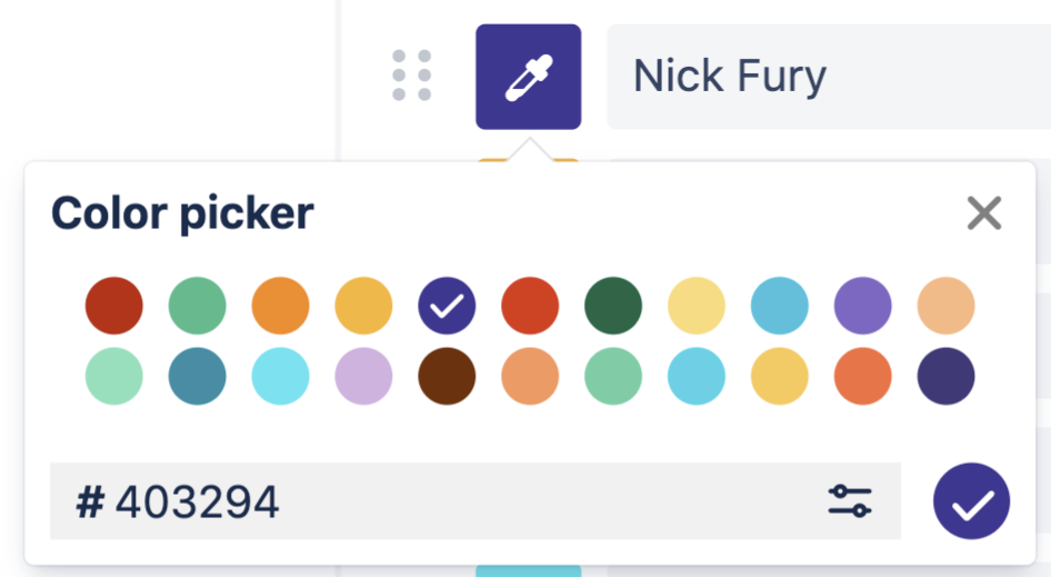
For even more customization select from a full-colour palette 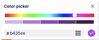
|
|---|
| 10 | Drag-and-drop | Drag-and-drop to reorder segments. 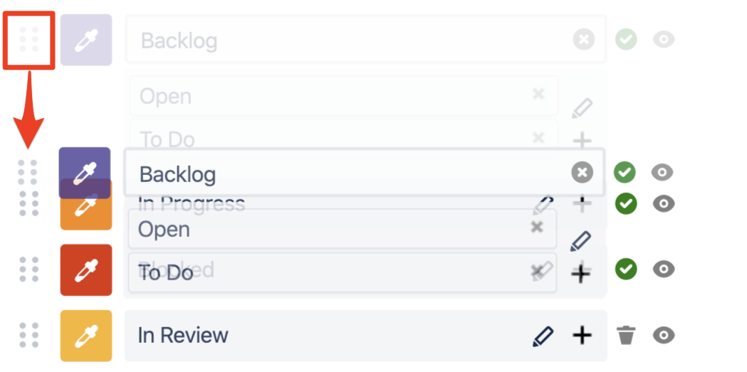
When a segment is manually moved the ordering selector changes to Custom Order. 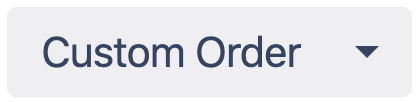
|
|---|
| 11 | Colors | Disable colors to hide the colored dots on the table. 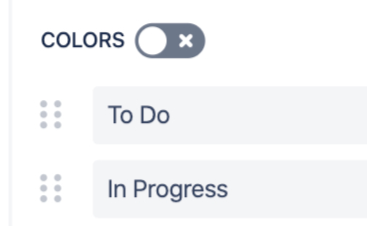
|
|---|
| 12 | Split segments | When additional values have been added to a segment, they can be split out using the small x in the top right corner of the option input. |
|---|
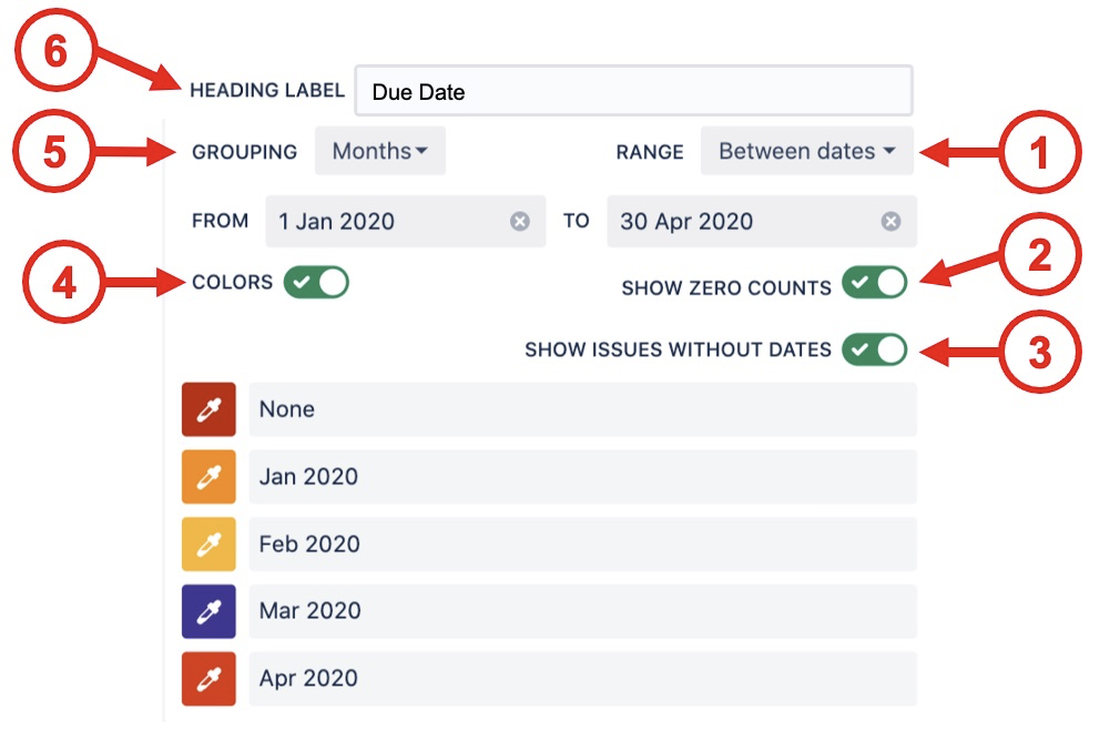
| 13 | Heading label | Customize the heading label for the Chart By and Group By values. |
|---|
Date Field Options
| Option | Description |
|---|
| 1 | Range | - Past 24 hours
- Past 3 days
- Past 7 days
- Past 30 days
- Past 90 days
- This week
- This month
- This quarter
- This year
- Last week
- Last month
- Last quarter
- Last year
- Dynamic range
- Between dates
- All dates
|
|---|
| 2 | Show zero counts | If the count value is zero for a segment use this selector to hide it from the chart. |
|---|
| 3 | Show issues without dates | For date fields that can be empty (e.g. due date) this selector shows those issues as a None segment at the start of the range. This is very useful to catch issues that do not have a date set. 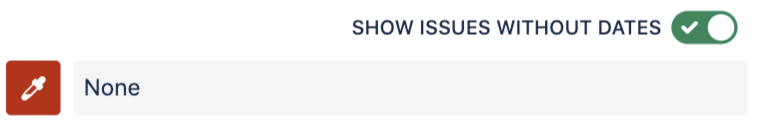
|
|---|
| 4 | Colors | Disable colors to hide the colored dots on the table. 
|
|---|
| 5 | Grouping | - Hours
- Days
- Weeks
- Months
- Quarters
- Years
|
|---|
| 6 | Heading label | Customize the heading label for the Chart By and Group By values. |
|---|
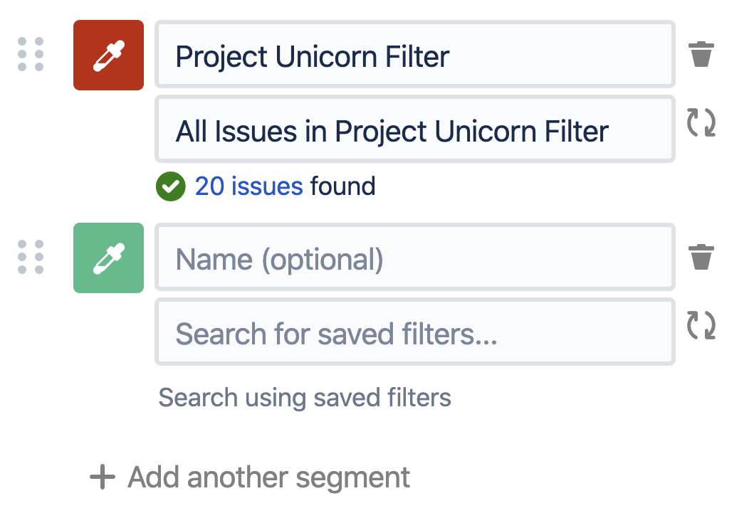
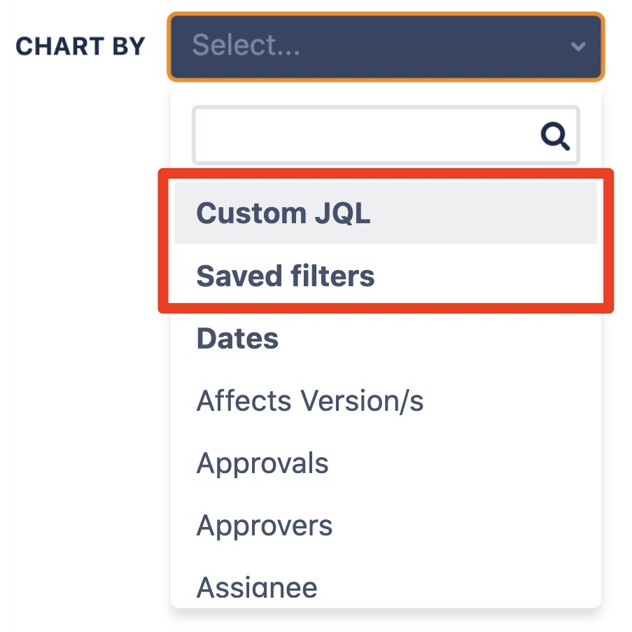
Custom JQL / Saved filters Options
To create fully custom charts you can use the advanced options Custom JQL or Saved filters to create segments.
Display Options
| Column Options | Description |
|---|
| Count/Sum/Average label | Customize the label used for Count/Sum/Average |
| Cumulative total | Count/Sum/Average will be aggregated sequentially in the order found in Chart By |
| Show number column | Displays a numbering column in the legend |
| Show tooltip on name hover | When enabled, hovering over a segment name will show a tooltip with the original segment name. When using JQL or Saved Filters, this will display the underlying JQL query. |
- Combine Source JQL with Custom JQL and Saved Filters
| When enabled, the JQL tooltip shown for JQL/Saved Filters will also include the JQL from the Source of the chart. |
| Columns | Description |
|---|
| Chart By | Displays the Chart By field |
| Calculate | Displays the calculation selected from the Calculate dropdown. To change this value, change the dropdown directly at the top of the chart. Use the eyeball to hide this column, if no other columns have been added. |
| Calculate % | Displays the percent associated with the calculation above. Use the eyeball to hide this column |
| Add column | Adds additional calculations to the chart. Each one added can be renamed using the pencil, have the percentage hidden using the eyeball, or remove the columns entirely by clicking the trash can. |
⠀
| Row Options | Description |
|---|
| Limit rows | Choose the maximum number of rows to display before "Show more..." is used Leave empty for unlimited rows |
| Show total row | Displays the total row |
Description Options (Only visible when the description is not empty) | Description |
|---|
Show description | Hide the description from displaying This can be used to keep notes on the configuration or design without showing it to users on the saved list |
Description position | Choose where the description is displayed The Live Preview in the editor always shows Bottom |
⠀
User Impersonation Options (Confluence only) | Description |
|---|
Show impersonation user under chart | Hide the "Data loaded as" label at the bottom of the macro |
Allow click-through (requires Jira access) | Allow users to click through to the underlying Jira issues This requires the user to have access to Jira as all Jira permissions are respected |
⠀
General Options | Description |
|---|
Number format | Choose the number format to display 123456.78 123,456.78 123.456,78 123'456.78 123'456,78
|
Decimal places | Choose the decimal places to display |
Auto refresh every <x> | When selected, the issue data will automatically refresh at the time interval set in the Custom Charts admin settings |
Show options menu button | When selected, a vertical set of 3 dots will appear in view mode that, when clicked, shows a menu with the following options: Refresh data Dark mode *Export PNG *Export PDF **Export CSV
*Only shows these options if “Allow direct export to PNG, PDF & CSV” is enabled. If this is disabled, it removes the export options from the list in view mode **Not available on Issue List |
Dark Mode | Changes the theme to dark mode. |
Show chart border (Confluence only) | Displays a border around the Confluence macro |
Unable to render {include} The included page could not be found.
Unable to render {include} The included page could not be found.