| Option | Description | |
|---|---|---|
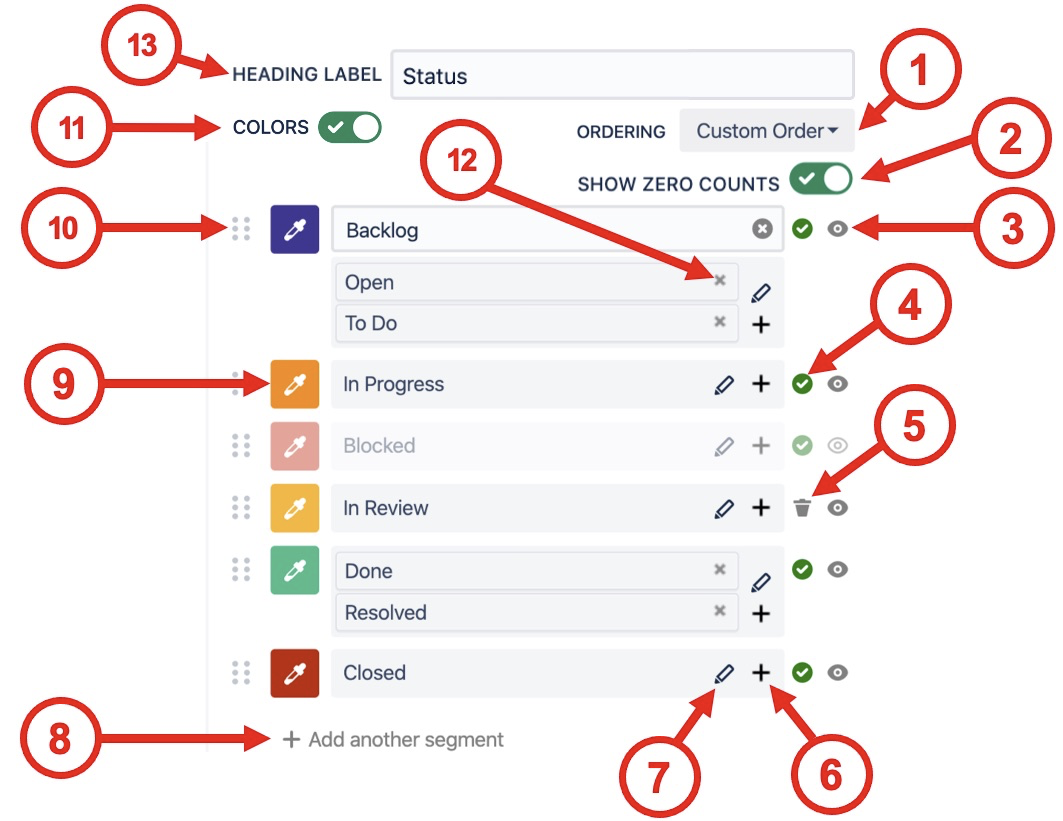
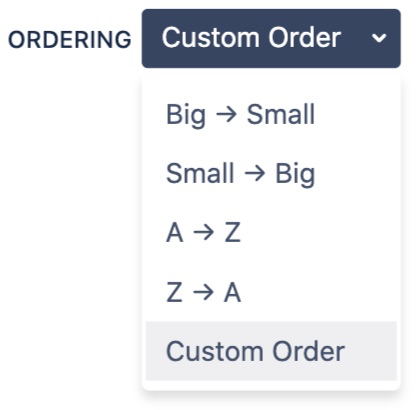
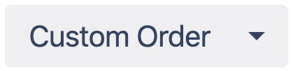
| 1 | Segment ordering | Orders segments by the value of their Counts or Names. Custom order is arranged by the user with the drag-and-drop interface.
|
| 2 | Show zero counts | If the count value is zero for a segment use this selector to hide it from the chart. |
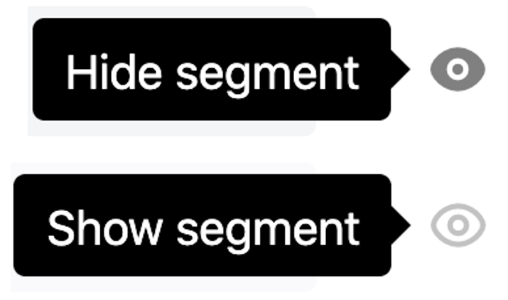
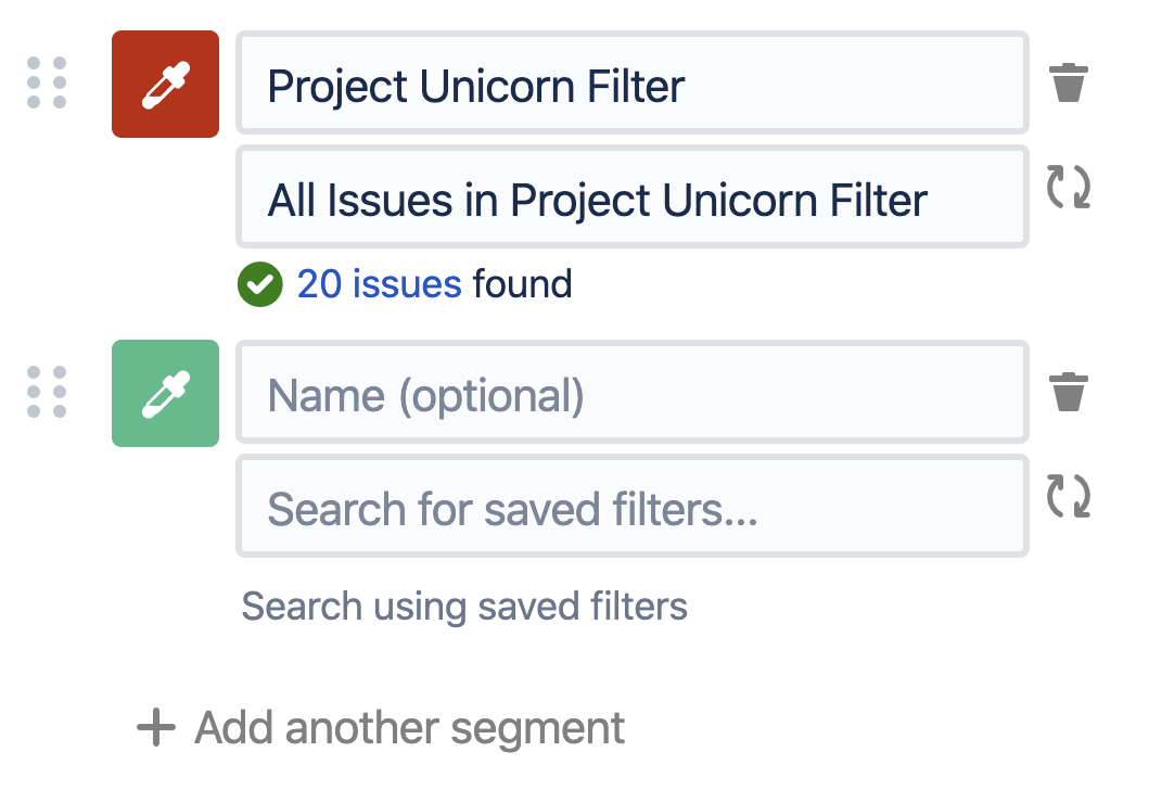
| 3 | Show / hide segments | If issues have been found for a segment then it cannot be deleted, but it can easily be hidden using show / hide segment button.
|
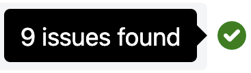
| 4 | Issues found indicator | A green tick indicates that issues have been found for the current segment. Hovering over the indicator shows a tooltip with the number of issues found.
|
| 5 | Delete segment | When zero issues are found for a segment it can be deleted.
|
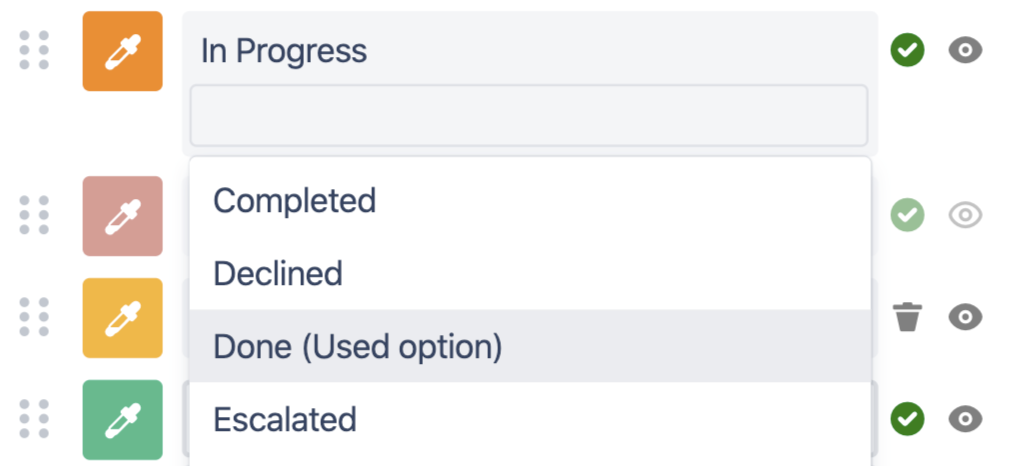
| 6 | Add additional values | Clicking the + opens a drop-down menu to pick additional values. Values already in use in other segments have the suffix (Used option). If a used option is selected it will be moved into the currently selected segment.
|
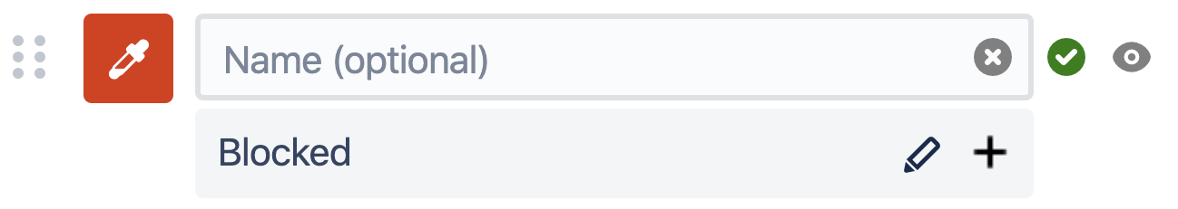
| 7 | Rename segment | Clicking the pencil button opens the "Name segment" input box.
The original segment values are displayed as a tooltip when hovering over the new name in the legend table.
|
| 8 | Add another segment | If a value has not been found in the current search (e.g. you're making a template chart) then you can add additional segments. This allows you to select the colors, name and order of appearance even before any issues have been found.
|
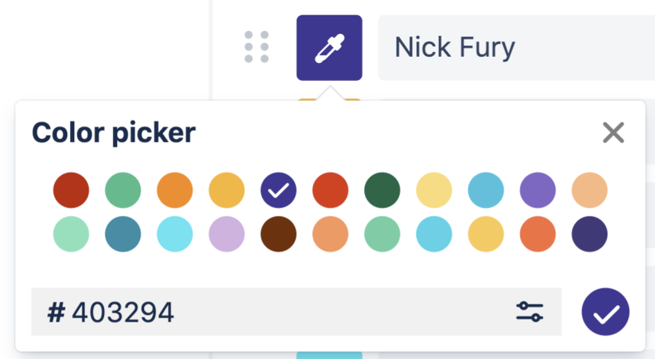
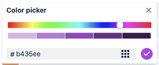
| 9 | Color picker | Pick from a color palette of 22 default options or use a custom hex code to get exactly what you need.
For even more customization select from a full-colour palette
|
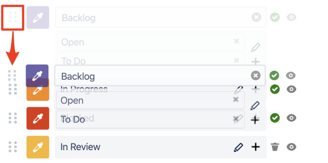
| 10 | Drag-and-drop | Drag-and-drop to reorder segments.
When a segment is manually moved the ordering selector changes to Custom Order.
|
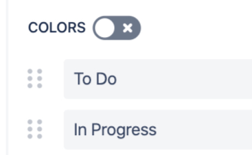
| 11 | Colors | Disable colors to hide the colored dots on the table.
|
| 12 | Split segments | When additional values have been added to a segment, they can be split out using the small x in the top right corner of the option input. |
| 13 | Heading label | Customize the heading label for the Chart By and Group By values. |


| Option | Description | |
|---|---|---|
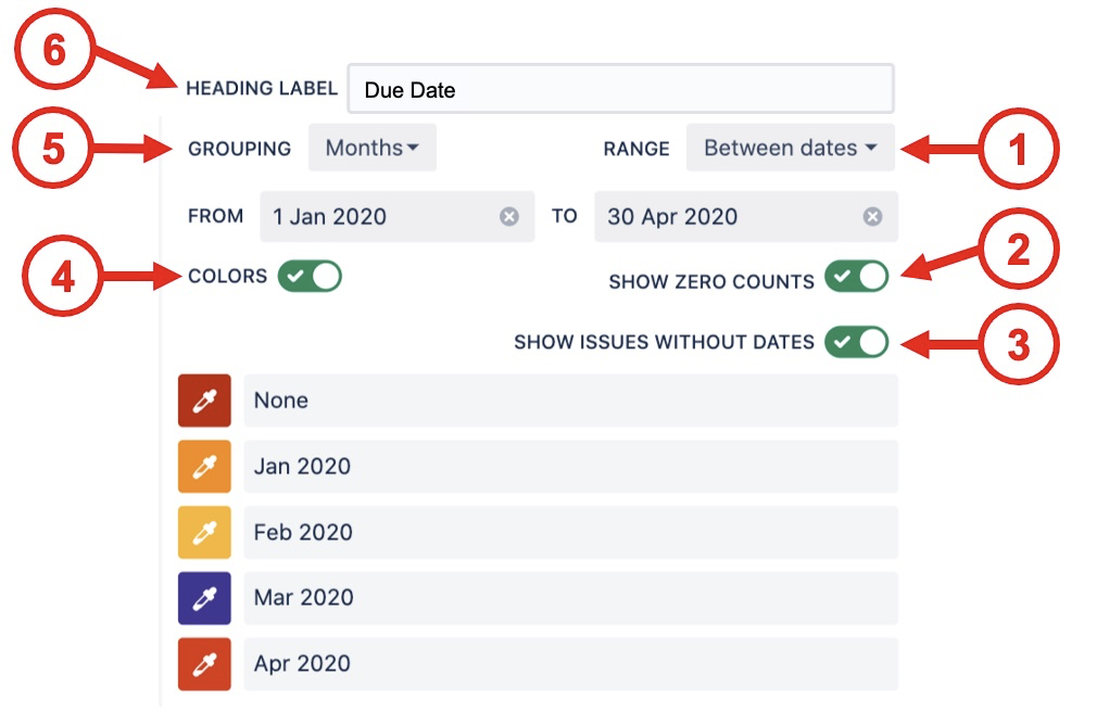
| 1 | Range |
|
| 2 | Show zero counts | If the count value is zero for a segment use this selector to hide it from the chart. |
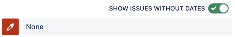
| 3 | Show issues without dates | For date fields that can be empty (e.g. due date) this selector shows those issues as a None segment at the start of the range. This is very useful to catch issues that do not have a date set.
|
| 4 | Colors | Disable colors to hide the colored dots on the table.
|
| 5 | Grouping |
|
| 6 | Heading label | Customize the heading label for the Chart By and Group By values. |

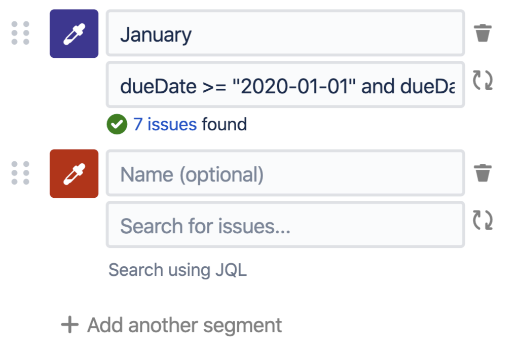
To create fully custom charts you can use the advanced options Custom JQL or Saved filters to create segments.
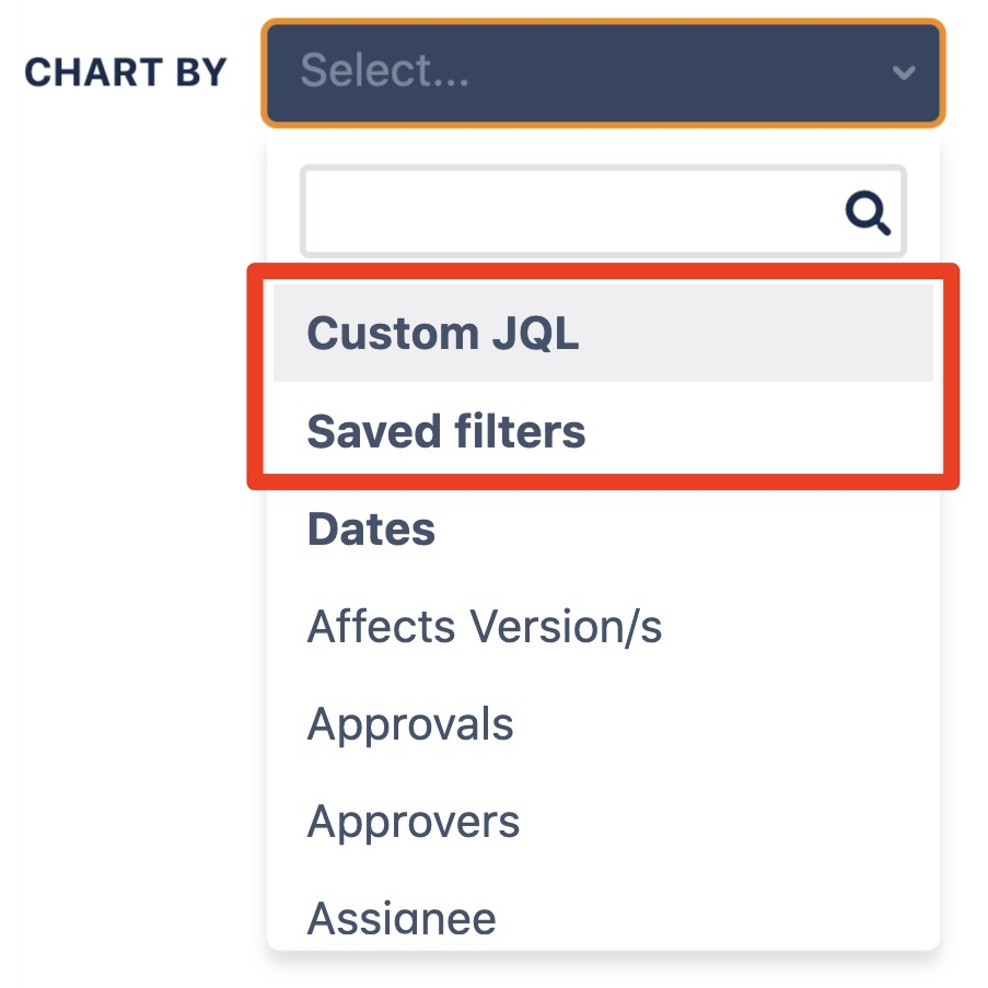
| Custom JQL | Saved Filters |
|---|---|
|
|
| Chart Options | Description |
|---|---|
| Count/Sum/Average label | Customize the label used for Count/Sum/Average |
| Cumulative total of Chart By / Group By | Count/Sum/Average will be aggregated sequentially in the order found in Chart By / Group By |
| Display | Choose how the data is displayed in the table
|
| Show Count/Sum/Average column | Displays the Count/Sum/Average value in a column |
| Show Group By heading label | Option to hide the Group By heading in the 2D table.
|

⠀
| Row Options | Description |
|---|---|
| Limit rows | Choose the maximum number of rows to display before "Show more..." is used Leave empty for unlimited rows |
| Show total row | Displays the total row |
Description Options (Only visible when the description is not empty) | Description |
|---|---|
Show description | Hide the description from displaying This can be used to keep notes on the configuration or design without showing it to users on the saved list |
Description position | Choose where the description is displayed
The Live Preview in the editor always shows Bottom |
⠀
User Impersonation Options (Confluence only) | Description |
|---|---|
Show impersonation user under chart | Hide the "Data loaded as" label at the bottom of the macro |
Allow click-through (requires Jira access) | Allow users to click through to the underlying Jira issues This requires the user to have access to Jira as all Jira permissions are respected |
⠀
General Options | Description |
|---|---|
Number format | Choose the number format to display
|
Decimal places | Choose the decimal places to display
|
Auto refresh every <x> | When selected, the issue data will automatically refresh at the time interval set in the Custom Charts admin settings |
Show options menu button
| When selected, a vertical set of 3 dots will appear in view mode that, when clicked, shows a menu with the following options:
*Only shows these options if “Allow direct export to PNG, PDF & CSV” is enabled. If this is disabled, it removes the export options from the list in view mode **Not available on Issue List |
Dark Mode | Changes the theme to dark mode. |
Show chart border (Confluence only) | Displays a border around the Confluence macro |